|
|
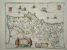
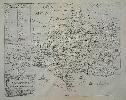
Imprint: Amsterdam, 1635-[50]
38 x 50 cms., early outline colour, a nice fresh example.
A beautiful map of Portugal and the Algarve. 'Cartografia Impressa dos Seculos XVI e XVII Imagens de Portugal ...' Exhibition Catalogue no. 29; 'Olhar o Mundo ler o Territorio' Exhibition Catalogue p. 98; Van der Krogt, P. (Atlantes) 6300:2.
Stock number:4136.
|
|
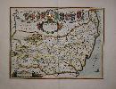
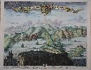
Imprint: Amsterdam, 1645-[62]
440 x 550 mm., in SUPERB early outline colour with extensive additional gilt and silver decoration and blue wash to the sea, with very large margins, reinforced lower right, otherwise in good condition.
This map of the Fenns is by Joan Blaeu (1598-1673), arguably the most famous of the Dutch cartographers. Here it is offered in EXTRA FINE COLOURING WITH EXTENSIVE USE OF GOLD. During the seventeenth century the Dutch held a dominant position in the production of high quality atlases. One of the more visual aspects of this was the reputation of its colourists. At its peak certain colourists began to produce work of an exceptional nature. Arguably the most famous of these was Dirk Jansz. Van Santen (1637/38-1708). Goedings made a study of his work in 1992. Although we are not stating that this is an example of his colouring many of his traits are repeated in this work. Goedings reports that Fontaine Verwey is of the opinion that Van Santen coloured atlases in three different ways: colouring without gold; gold just for the legends, cartouches, coats of-arms and decorative motifs of a map; and gold on the maps themselves, for frontiers, cities, etc.. About the only trait not found in this collection of maps is that of extending the foreground or background of the cartouches.The style of colouring is described by Goedings as signified by rich and exotic colour combinations, added elements such as flowers to clothing, marbling to masonry. He applied transparent and opaque colours at the same time in both mixed and pure tints. He often painted the whole surface of the map or illustration, transforming the graphic light and dark contrasts into colour
He applied his characteristic shiny varnish, this had the effect of brightening the colour, frequently making use of the same colour progression
His use of colour was much freer than that of other colourists. The tone of the colours was made to complement the gold he used so lavishly. In his best work two other costly pigments, ultramarine and carmine are found in large amounts, mostly set against gold. Ultramarine and gold were a very popular colour combination in the seventeenth century
Moreover, he added elements to the design, such as patterns and flower motifs to the clothing of figures, veining of stones or map frontier lines
Van Santen applied transparent and opaque colours at the same time in both mixed and pure tints
Above all things Van Santen distinguished himself from his contemporaries in his lavish use of gold which he applied meticulously. On maps he applied gold not only to the decorative motifs, the legends, cartouches and coats-of-arms, but he also worked it decoratively into the map itself.Goedings goes on to describe Van Santens use of 'shell gold'. Gold leaf was available in small booklets of approximately 5 x 5 centimetres containing a number of very thin sheets of gold. A 17th century method of making shell gold from gold leaf was to grind it on a rubbing stone along with honey, water and salt and then to wash it in very clean water. The small amount of liquid gold was then placed in a shell and vinegar was added to it. The vinegar assured a good consistency
Needless to say, this high quality shell gold was very expensive and must have been paid for by the customers of large, prestigious projects, as in the case of Van der Hem. Seventeenth century instructions for applying gold to paper have been preserved and give an indication of the complexity of this treatment. In all likelihood, Van Santen had developed his own method for applying gold to paper
As far as one can tell with the naked eye, he first put on a yellow base before using a brush to apply the gold. Scientific tests might make it possible to determine more about Van Santen's characteristic use of material, particularly about his use of gold. This could make it easier to identify his work. All of these traits can be seen on these particular examples, however we cannot say who the colourist is.Several attempts had been made to drain the Fenns as this area was known without great success dating back to the Romans. The region contained busy trading ports and there was much opposition to any such work. The first map of the region was by William Hayward in 1604 which it appears was never engraved. The first printed map apparently derived from Hayward is that of Henricus Hondius published in Amsterdam, 1633, which was followed by a similar map by Joan Blaeu offered here. Draining the region would become the greatest engineering achievement of the seventeenth century. Joan Blaeu's father Willem established his firm in 1599 as instrument and globe makers. He went on to produce some of the highest quality atlases ever published. This example is from the rare final Spanish text issue of the 'Atlas Major' whose production was interrupted by the great fire at the Blaeu publishing house in 1672. Goedings, Truusje (1992) 'Master Colourist Dirk Jansz. Van Santen 1637/38-1708'; Koeman Bl 60A p. 281; Van der Krogt, P. (Atlantes) 5310:2; Skelton (1970) 28 & 73.
Stock number:8864.
|
|
Imprint: Amsterdam, c.1650
420 x 510 mm., early outline colour with Latin text to the verso, light even toning and small foxmark left side otherwise in good condition.
Joan Blaeu (1598-1673) is one of the most famous of the Dutch cartographers. The fourth volume of his 'Novus Atlas' focused on England and Wales. Willem Blaeu established the firm in 1599 as instrument and globe makers. He went on to produce some of the highest quality atlases ever published. King 11; Skelton 28; Van der Krogt, P. (Atlantes) 5350:2.
Stock number:5719.
|
|
|
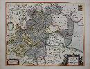
Imprint: Amsterdam, 1645-[63]
420 x 510 mm., early outline colour with French text to the verso, with large margins and in good condition.
Willem Blaeu established the firm in 1599 as instrument and globe makers. His first topographical atlas appeared in 1630, in one volume and was gradually expanded. By 1640 the 'Novus Atlas' by his Joan Blaeu (1598-1673), was in three volumes and contained just 4 British Isles maps. His chief rival, the Hondius-Jansson atlas contained 18 maps. Both joined a race to make their fourth volumes a complete atlas of the British Isles. Blaeu was first, publishing his magnificent work in 1645, one year before that of Janssonâs. The work of Blaeu set a standard of design, beauty and quality that arguably has never been surpassed. He went on to produce some of the highest quality atlases ever published. This map of Staffordshire bears attractive coats of arms and two ornate cartouches in the lower corners. This is an example from the French edition of the 'Atlas Major' of 1663 with French text. This later work is considered the finest atlas ever produced including upwards of 600 maps. Koeman Bl58 332; King 11; Skelton 28 & 72; Van der Krogt, P. (Atlantes) 5350:2.
Stock number:10441.
|
|
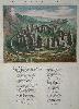
Imprint: Amsterdam, c.1650
195 x 250 mm., on a sheet of text, in superb early wash colour, good condition.
A superb view of Stonehenge in beautiful early colour by Joan Blaeu (1598-1673) who is one of the most famous of the Dutch cartographers. From the fourth volume of his 'Novus Atlas' focused on England and Wales. Willem Blaeu established the firm in 1599 as instrument and globe makers. He went on to produce some of the highest quality atlases ever published. Skelton 28.
Stock number:5377.
|
|
Imprint: Amsterdam, 1645-[46]
38 x 50 cms., early outline colour
ex 'Novus Atlas'. Joan Blaeu (1598-1673) is one of the most famous of the Dutch cartographers. The fourth volume of his atlas focused on England and Wales. Blaeu established his firm in 1599 as instrument and globe makers. He went on to produce some of the highest quality atlases ever published. From the Dutch text edition of 1646 issued one year after initial publication. Skelton 28; Van der Krogt, P. (Atlantes) 5290:2.
Stock number:3424.
|
|
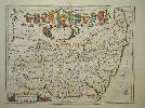
Imprint: Amsterdam, 1645-[62]
380 x 500 mm., in SUPERB early outline colour with extensive additional gilt and silver decoration and blue wash to the sea, with large margins, some gilt offset to the title otherwise in very good condition.
This map of the Suffolk is by Joan Blaeu (1598-1673), arguably the most famous of the Dutch cartographers. Here it is offered in EXTRA FINE COLOURING WITH EXTENSIVE USE OF GOLD. During the seventeenth century the Dutch held a dominant position in the production of high quality atlases. One of the more visual aspects of this was the reputation of its colourists. At its peak certain colourists began to produce work of an exceptional nature. Arguably the most famous of these was Dirk Jansz. Van Santen (1637/38-1708). Goedings made a study of his work in 1992. Although we are not stating that this is an example of his colouring many of his traits are repeated in this work. Goedings reports that Fontaine Verwey is of the opinion that Van Santen coloured atlases in three different ways: colouring without gold; gold just for the legends, cartouches, coats of-arms and decorative motifs of a map; and gold on the maps themselves, for frontiers, cities, etc.. About the only trait not found in this collection of maps is that of extending the foreground or background of the cartouches.The style of colouring is described by Goedings as signified by rich and exotic colour combinations, added elements such as flowers to clothing, marbling to masonry. He applied transparent and opaque colours at the same time in both mixed and pure tints. He often painted the whole surface of the map or illustration, transforming the graphic light and dark contrasts into colour
He applied his characteristic shiny varnish, this had the effect of brightening the colour, frequently making use of the same colour progression
His use of colour was much freer than that of other colourists. The tone of the colours was made to complement the gold he used so lavishly. In his best work two other costly pigments, ultramarine and carmine are found in large amounts, mostly set against gold. Ultramarine and gold were a very popular colour combination in the seventeenth century
Moreover, he added elements to the design, such as patterns and flower motifs to the clothing of figures, veining of stones or map frontier lines
Van Santen applied transparent and opaque colours at the same time in both mixed and pure tints
Above all things Van Santen distinguished himself from his contemporaries in his lavish use of gold which he applied meticulously. On maps he applied gold not only to the decorative motifs, the legends, cartouches and coats-of-arms, but he also worked it decoratively into the map itself.Goedings goes on to describe Van Santens use of 'shell gold'. Gold leaf was available in small booklets of approximately 5 x 5 centimetres containing a number of very thin sheets of gold. A 17th century method of making shell gold from gold leaf was to grind it on a rubbing stone along with honey, water and salt and then to wash it in very clean water. The small amount of liquid gold was then placed in a shell and vinegar was added to it. The vinegar assured a good consistency
Needless to say, this high quality shell gold was very expensive and must have been paid for by the customers of large, prestigious projects, as in the case of Van der Hem. Seventeenth century instructions for applying gold to paper have been preserved and give an indication of the complexity of this treatment. In all likelihood, Van Santen had developed his own method for applying gold to paper
As far as one can tell with the naked eye, he first put on a yellow base before using a brush to apply the gold. Scientific tests might make it possible to determine more about Van Santen's characteristic use of material, particularly about his use of gold. This could make it easier to identify his work. All of these traits can be seen on these particular examples, however we cannot say who the colourist is.Joan Blaeu's father Willem established his firm in 1599 as instrument and globe makers. He went on to produce some of the highest quality atlases ever published. This example is from the rare final Spanish text issue of the 'Atlas Major' whose production was interrupted by the great fire at the Blaeu publishing house in 1672. Across the top of the map are the arms of the nobles in the county. Goedings, Truusje (1992) 'Master Colourist Dirk Jansz. Van Santen 1637/38-1708'; Koeman Bl 60A p. 281; Van der Krogt, P. (Atlantes) 5290:2; Skelton (1970) 28 & 73.
Stock number:8867.
|
|
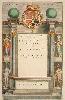
Imprint: Amsterdam, 1640-50
405 x 250 mm. In early wash colour, very decorative, heightened in gold.
This ornate title page is from Joan Blaeu's 1650 Latin edition of the second volume of the 'Novus Atlas' and is heightened in gold.
Stock number:2787.
|
|
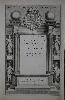
Imprint: Amsterdam, 1650
410 x 250 mm., in good condition with extended margin to the right margin.
This ornate title page is from the Latin edition of Joan Blaeu's 'Novus Atlas' second volume published in 1650.
Stock number:8725.
|
|
|
Imprint: Amsterdam, 1648
415 x 240 mm., fine early wash colour heightened with extensive use of gold, light water stain upper right, small tear to lower margin, otherwise in good condition.
This ornate title page is from the Latin edition of Joan Blaeu's 'Novus Atlas', the fourth volume published in 1648 which covered England and Wales.
Stock number:9704.
|
|
Imprint: Amsterdam, 1682
450 x 580 mm., with recent wash colour, a centrefold split expertly repaired so that it is virtually invisible, otherwise in good condition.
Joan Blaeus famous town books of Italy were first published in three volumes (the Vatican, Rome, and Naples and Sicily) in 1663. Two further volumes were added by his heirs in 1682, those of Piedmont and Savoye. Unlike the town books of the Netherlands the Italian volumes not only contain maps and birds-eye views, but also many engravings and plans of the towns, palaces, churches, statues and other architecture. It is one of the most visually appealing and highly prized of all illustrated books on Italy. This is a superb view taken from Saint Jean Cap Ferrat of Villefranche-sur-Mer, near Nice, Provence. From the Theatrum Statuum Regiae Celsitudinis Sabaudiae Ducis, Pedemontii Principis ... Fauser, A. 14895; Koeman (1967-70) Bl 76 no. 1058.
Stock number:3866.
|
|
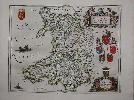
Imprint: Amsterdam, 1645-[48]
390 x 500 mm., early outline colour and in good condition.
Willem Blaeu established the firm in 1599 as instrument and globe makers. His first topographical atlas appeared in 1630 in one volume and was gradually expanded. By 1640 the 'Novus Atlas' by his Joan Blaeu (1598-1673) was in three volumes and contained just 4 British Isles maps. His chief rival, the Hondius-Jansson atlas contained 18 maps. Both joined a race to make their fourth volumes a complete atlas of the British Isles. Blaeu was first, publishing his magnificent work in 1645, one year before that of Janssons. The work of Blaeu set a standard of design, beauty and quality that arguably has never been surpassed. He went on to produce some of the highest quality atlases ever published. This attractive map of Wales bears an ornate title upper right which is held aloft by cherubs beneath which are the arms of Wales, Bangor, St. Assaph, St. Davids and Llandaf. Below that is the dedication to King Charles I surmounted by the Royal Arms. The map itself is largely derived from that of John Speed. It is one of the more beautiful maps of Wales. This is an early example from 1648 with German text. Booth (1977) no. 14; Koeman Bl47D; Roberts, Iolo & Menai Printed Maps of the whole of Wales 1573-1837 Part 1 in The Map Collector no. 68 pp. 34-9; Skelton 28 & 44; Van der Krogt, P. (Atlantes) 5500:2.
Stock number:9012.
|
|
|
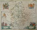
Imprint: Amsterdam, c.1650
380 x 500 mm., in early outline colour with French text to the verso, in good condition.
Willem Blaeu established the firm in 1599 as instrument and globe makers. His first topographical atlas appeared in 1630, in one volume and was gradually expanded. By 1640 the 'Novus Atlas' by his Joan Blaeu (1598-1673), was in three volumes and contained just 4 British Isles maps. His chief rival, the Hondius-Jansson atlas contained 18 maps. Both joined a race to make their fourth volumes a complete atlas of the British Isles. Blaeu was first, publishing his magnificent work in 1645, one year before that of Janssonâs. The work of Blaeu set a standard of design, beauty and quality that arguably has never been surpassed. He went on to produce some of the highest quality atlases ever published. This map of Westmoreland bears attractive coats of arms and several ornate cartouches. This is an example from the French edition of the 'Atlas Major' of 1663 with French text. This later work is considered the finest atlas ever produced including upwards of 600 maps. Koeman Bl58 352; Skelton 28 & 72; Van der Krogt, P. (Atlantes) 5380:2.
Stock number:10443.
|
|
|
Imprint: Amsterdam, 1645
410 x 500 mm., in early outline colour with wash to the cartouches, French text to the verso, in good condition.
Willem Blaeu established the firm in 1599 as instrument and globe makers. His first topographical atlas appeared in 1630, in one volume and was gradually expanded. By 1640 the 'Novus Atlas' by his Joan Blaeu (1598-1673), was in three volumes and contained just 4 British Isles maps. His chief rival, the Hondius-Jansson atlas contained 18 maps. Both joined a race to make their fourth volumes a complete atlas of the British Isles. Blaeu was first, publishing his magnificent work in 1645, one year before that of Janssonâs. The work of Blaeu set a standard of design, beauty and quality that arguably has never been surpassed. He went on to produce some of the highest quality atlases ever published. This map of Warwickshire and Worcestershire bears attractive coats of arms and an ornate title cartouche. This is an example from the French edition first published in 1645. Harvey & Thorpe 11; Koeman Bl42A 331; Skelton 28 & 29; Van der Krogt, P. (Atlantes) 5345:2.
Stock number:10442.
|
|
|
Imprint: London, L. Tallis, 21, Warwick Square, Paternoster Row, c.1860
Binding: Hardback Quarto, 2 volumes (245 x 155 mm. each), contemporary half calf, cloth boards, ornate blind ruling, spine with ornate gilded raised bands, blind ruled compartments, gilt volume numbers and gilt calf title labels. With engraved frontispiece, engraved title page, typographic title page, pp. (2), ii, (40, 812; (2), 813-1582, with 58 steel engraved maps consisting of 2 general, 43 English county maps (Yorkshire divided into 4), Isle of Wight and 12 Welsh counties all in full early wash colour, front endpapers to second volume stuck to each other, back board of volume 2 coming loose, otherwise in good condition.
VERY RARE. Thomas Dugdale was an antiquarian and responsible for this the 'Curiosities of Great Britain'. The work was issued with two distinct sets of maps. The first utilised those maps from the George Cole and John Roper 'British Atlas' of 1810. The second series used a new set of maps engraved by Joshua Archer (1792-1863) which were derived from those of Cole and Roper. The publishers J. & F. Tallis had acquired the Cole and Roper plates and the Dugdale text by c.1835. They continued to issue the text with the maps and then offered this new series of plates concurrently. The firm of Tallis then published this 'Topographical Dictionary' edited by Edward Litt Laman (E. L.) Blanchard (1820-89). Blanchard came from the theatre and was at one point responsible for the annual pantomime at the Theatre Royal, Drury Lane. He began work on the 'Dictionary' in 1852 and was paid on average £2-3 per part. The final 43rd part was supplied in December 1859. The finished work is published by Lucinda Tallis (1792-1869), widow of John Tallis who died in 1842. The 'Topographical Dictionary' was presumably not very successful as it is extremely rare. The only known examples are at Cambridge University Library and three in private English collections, this possibly being one of them. Provenance: Clive A Burden Ltd. Catalogue 14 (2017) item 5; private English collection. Beresiner (1983) pp. 46-7; Carroll (1996) 112; Smith, D. (1985) pp. 123-4; Worms & Baynton-Williams (2011).
Stock number:10308.
|
|
|
Imprint: Amsterdam, Chez Abraham Wolfgang, pres la Bourse, 1688
Duodecimo (150 x 85 mm.), full contemporary calf, blind panelled, with ribbed spine, very ornate gilt decoration to compartments, gilt title, gilt slightly worn. With typographic title page, pp. [4], 331, [1], p. 236 erroneously numbered 136, with 7 folding maps, otherwise in excellent condition.
Richard Blome (1635-1705) was the son of Jacob Bloome a member of the Stationers Company. Although his family name is written in contemporary documents as Bloome he himself used Blome. He was made free of the Stationers Company in August 1660 at the time of the Restoration of Charles II. According to Skelton he began as a ruler of paper and a heraldic painter, both features which are seen in his later works. His earliest known work is a geographical treatise published in 1663. From 1667 the first of a series of maps of the world was engraved for A Geographical Description of the Four Parts of the World published in 1670. In 1672 he published A Description of the Island of Jamaica which included some significant maps relating to North America. This is Abraham Wolfgangs translation of Richard Blomes popular The Present State of His Majesties Isles and Territories in America, published in London 1687, which included different maps by Robert Morden. For the work Wolfgang had seven maps engraved, curiously four are derived from the Robert Morden maps found in the 1687 Blome. These include maps of New England and Canada, Barbados and Bermuda.The Morden plate of Carolina was first published in 1680, but here it is drawn from the second state of 1687 as published within the English edition of Blome. It is identical in all matters to the earlier map, including all the Lederer cartography, with one exception. Hilton Head is engraved as Hilson Head, reflecting the engraver being misled by the t of the earlier map (Burden).The map of New England is a unique composition derived from the original Blome of 1672. It bears no direct resemblance to either the Blome of 1672, or the Morden which appeared in the Blome edition of 1687. The inland waterways and Cape Cod, in particular, are very disparate. New York is shown at the tip of a peninsula rather than being on an island, and the Hudson River bears an abrupt bend upriver (Burden). The map entitled Pensylvanie is in fact centred on the Chesapeake Bay and Virginia. This detailed small map keys twenty-nine features to an Explication lower right; the majority are counties. Like that of New England, this map is not derived from any clear source. An unusually slim New Jersey is depicted and the border between Maryland and Pennsylvania is placed too far north, just south of Philadelphia. The Delaware peninsula is leaning eastwards slightly and is broader at its neck than accepted at the time (Burden). It is an example of the first state, first identified in Burden. The final map is in fact bound first in the work and is derived from Blomes 1672 map. This map chiefly describes Jamaica, but like its predecessors it bears a large inset map of the Gulf of Mexico, the Caribbean and the south-eastern portion of North America (Burden). The text describes the English colonies in North America and the Caribbean. Provenance: Reiss 13.10.93 lot 2467; Burden collection. Baer (1949) no. 126; Burden (2007) nos. 638-42; Cumming & De Vorsey (1998) no. 108; McCorkle (2001) no. 688.4; Sabin 5969.
Stock number:9894.
|
|
|
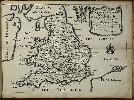
Imprint: London, Printed for Tho. Roycroft for the Undertaker, Richard Blome, 1673-[74]
Binding: Hardback Inscription: Signed, Inscribed Or Annotated Folio (300 x 195 mm.), 2 parts in one volume, recent half calf, blind ruled, cloth boards, spine with raised bands, blind ruled compartments, gilt date and red calf gilt title label. Typographic title printed in red and black, verso blank, dedication to Charles II, verso blank, Preface 5 pp., Table of Benefactors 5 pp., paginated 1-341, typographic title page 'An Alphabetical Account', verso blank, paginated 345-464, with some marginalia, pp. (14), 464. With 51 engraved maps (49 of 50 double page or folding maps, one single page map of London by Wenceslaus Hollar), 24 pages of engraved coats of arms on 12 leaves in numbered to 812. General map split at the fold, Cheshire apparently never bound in, Dorset with repaired tear, Rutland and Staffordshire inserted from another example, Worcester and East Riding with small corner loss, North Wales with right side torn away, otherwise in good condition.
Richard Blome (1635-1705) was the son of Jacob Bloome a member of the Stationers Company. Although his family name is written in contemporary documents as Bloome he himself used Blome. He was made free of the Stationers Company in August 1660 at the time of the Restoration of Charles II. According to Skelton he began as a ruler of paper and a heraldic painter, both features which are seen in his later works. His earliest known work is a geographical treatise published in 1663. From 1667 the first of a series of maps of the world was engraved for A Geographical Description of the Four Parts of the World published in 1670. The maps were openly described as copies of those of Nicolas Sanson in Paris and Blomes work was derided by earlier commentators. This was a very early phase of English map publishing and the undertaking was full of peril.Arguably the most difficult part of atlas production was the finance; these were expensive works to produce. Although the system of selling subscriptions was not a new one at the time, Blome became one of the best exponents of the practice. In return for an early deposit to finance its publication the subscriber would not only receive a copy of the final work but his coat of arms engraved on a particular map or elsewhere in the book. This is particularly well illustrated in the 'Britannia' published in 1673 where twenty-four pages of coats-of-arms of subscribers are included, a grand total of 806 in the first issue. Each subscriber was charged 20s., 10s. paid in advance. Pandering to that market he included at the end of the work An Alphabetical Account of the Nobility and Gentry Which are (or lately were) related unto the several Counties ... This 118 page catalogue contained the names, titles, seats and offices held of the nobility as Blome claimed the like never before published. The 'Britannia' it appears was first conceived in 1668. On 28 July 1668 Richard Blome entered the title English Atlas at Stationers Hall. Shortly after he issued a Prospectus in which he announced that Volume I would be an English translation of Bernhard Varenius 'Geographia Generalis' with 100 maps, first published in Latin in Amsterdam 1650. Volume II was to be a world atlas with the text and maps drawn from that of Nicolas Sanson. Volume III was to be a description of Britain. The second volume was published in 1670 and soon after a further prospectus was issued claiming that the work would be printed by Trinity Term 1671. It was announced as being ready for the press on 13 February 1671 followed by a further prospectus promising it by Michaelmas Term 1671. It was finally advertised in the 'Term Catalogues' on 24 November 1673 for 30s.The initial plates of coats of arms exist in a number of variants with 806 coats of arms, 807, 808, 811, 812 and 827 coats-of-arms. This example is the most usually found issue with 812 arms. Similarly it bears the later states of the four maps which were altered: Cumberland, Middlesex, Warwick and the West Riding. The latter is dedicated to the Viscount Latimer, a title created in 1674. Blome conceived his work as a successor to William Camdens 'Britannia' of which he stated it was scarce, much out of print, and never like to be reprinted (Robert Morden would publish a further edition in 1695). The maps are largely copied from Speed reduced to about two-thirds in size and the text from Camden. Both led later commentators to deride the work, not entirely undeservedly. However, as a feat of publishing it has to be admired. Blome did request new material from people with local knowledge to correct and update the existing authorities. Each chapter is headed by a map of the region with the notable exception of the seventeen page one on the Isles and Territories Belonging to His Majesty in America. Four of the maps are signed by their engravers: the general map of the British Isles is by Francis Lamb, Berkshire is etched by Wenceslaus Hollar as is the fine plan of London, Scotland and Ireland are by Richard Palmer. There are five maps of Yorkshire, an unusual one being of 'Richmond Shire'. Provenance: ink inscription on first original flyleaf 'J. Jenkins Ashby 1831; private English collection. Arber (1903-06) I. 69; Chubb (1927) 99; ESTC R7330; Pennington (1982) no. 659; Shirley (2004) T.Blom 2a; Skelton (1970) 90; Wing (1945-51) B3207; Worms & Baynton-Williams (2011).
Stock number:9774.
|
|
Imprint: London, 1693
Binding: Hardback Folio (355 x 235 mm.), two parts bound as one, full contemporary calf, blind panelled boards with ornate decoration, rebacked preserving original spine, gilt ruled raised bands, with red calf gilt title label. Lacking all maps, with 3 double page copperplates pp. (8), 364; (2), 493, otherwise in good condition.
This geographical work was conceived in 1668 as volume two of a series of four. It was a translation of Nicolas Sansons work. In this work he proposed a fourth volume as a marine atlas of the world, it was never published. Volume one is a translation of Bernard Varenius 1650 work which did not appear until 1682. This is a third edition published in 1693. Provenance: bookplate of Sir Joseph Radcliffe Bart. ESTC R2029; Skelton 90.
Stock number:7906.
|
|
Imprint: London, Thomas Taylor at ye Golden Lyon in Fleetstreet, 1717-[18]
Binding: Hardback Oblong quarto (210 x 290 mm.), modern half calf, green cloth boards, gilt ruled, spine with gilt ruled raised and ornate gilt feature to compartments, red calf gilt title label. With engraved title page and 42 maps numbered to 41, Scotland and Ireland unnumbered and here unusually bound at the end, Cumberland and Westmoreland combined 8 & 9. The England map is in Hodsons state c, Scotland state b and Ireland state a, with all county maps in their expected state bearing roads. Manuscript notation lower right of the title. All leaves backed on linen as they were originally folded twice for the pocket, with loss at the folds to some, notably the title page, Chester, Devon, Durham, Gloucestershire, Monmouth, Suffolk and Wiltshire. Otherwise in good condition.
The plates used in this atlas were first published by Richard Blome as Speeds Maps Epitomiz'd in 1681. A further edition followed in 1685 and a Cosmography and Geography in 1693. The whereabouts of the Blome plates after 1693 is unknown. Blome had died in 1705 but it is unlikely that Thomas Taylor (c.1670-1730) acquired them at this date as no issue is known before 1715. The earliest we hear of Taylor in business is 1711. The England Exactly Described was first advertised in the Daily Courant 24 September 1715. The earliest versions of the atlas did not contain a map of Scotland but reacting to news of the Jacobite Rebellion earlier in the month he quickly rectified this advertising the fact by the first week in November. This edition is dated from an advert placed in the Daily Courant 1 March 1716/17. It bears a re-worded title and four new leaves describing the roads. It was described as being with the Post Roads and Measured Miles from Town to Town, according to Mr. Ogilbys Survey of the Roads ... with a New Table of the Roads ... To each map, Taylor has added roads and distances in small circles. A general map of Ireland dated 1716 has been added to the work giving a total of 42 maps. This atlas is closest to O in Hodsons listing. The Gardner copy of the Bakewell edition now in the British Library was similarly issued in a twice folded format. Provenance: acquired from the David Kingsley collection in August 1989; Burden collection. ESTC T166162; Hodson (1984-97) 140; Shirley (2004) T.Blom 3f; Worms & Baynton-Williams (2011).
Stock number:9276.
|
|
Imprint: London, 1673
Edition: First Edition 250 x 310 mm., in good condition.
This attractive map is from the 'Britannia' which was intended as the third part of Richard Blome's grand atlas in four volumes announced in 1668. Lambasted by Bishop Nicolson in 1696 as 'a most entire piece of theft out of Camden and Speed' and by Richard Gough in 1780 as 'a most notorious piece of plagiarism'. Blome himself disclaimed originality claiming in the Preface 'I do not own myself the Author, but the Undertaker [i.e. publisher] of this work'. One should remember that this was the first edition of Camden's 'Britannia' to be issued with maps since the 1630s. Blome was one of the earliest to finance his works by subscription. One later edition of the work is known in 1677 which survives in just one known example. Beaton pp. 28-9; Shirley BL T.Blom-2a; Skelton 90.
Stock number:5604.
|
|