|
|
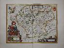
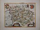
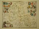
Imprint: Amsterdam, 1645-[62]
380 x 500 mm., in SUPERB early outline colour with extensive additional gilt and silver decoration, in very good condition.
This map of Leicestershire is by Joan Blaeu (1598-1673), arguably the most famous of the Dutch cartographers. Here it is offered in EXTRA FINE COLOURING WITH EXTENSIVE USE OF GOLD. During the seventeenth century the Dutch held a dominant position in the production of high quality atlases. One of the more visual aspects of this was the reputation of its colourists. At its peak certain colourists began to produce work of an exceptional nature. Arguably the most famous of these was Dirk Jansz. Van Santen (1637/38-1708). Goedings made a study of his work in 1992. Although we are not stating that this is an example of his colouring many of his traits are repeated in this work. Goedings reports that Fontaine Verwey is of the opinion that Van Santen coloured atlases in three different ways: colouring without gold; gold just for the legends, cartouches, coats of-arms and decorative motifs of a map; and gold on the maps themselves, for frontiers, cities, etc.. About the only trait not found in this collection of maps is that of extending the foreground or background of the cartouches.The style of colouring is described by Goedings as signified by rich and exotic colour combinations, added elements such as flowers to clothing, marbling to masonry. He applied transparent and opaque colours at the same time in both mixed and pure tints. He often painted the whole surface of the map or illustration, transforming the graphic light and dark contrasts into colour
He applied his characteristic shiny varnish, this had the effect of brightening the colour, frequently making use of the same colour progression
His use of colour was much freer than that of other colourists. The tone of the colours was made to complement the gold he used so lavishly. In his best work two other costly pigments, ultramarine and carmine are found in large amounts, mostly set against gold. Ultramarine and gold were a very popular colour combination in the seventeenth century
Moreover, he added elements to the design, such as patterns and flower motifs to the clothing of figures, veining of stones or map frontier lines
Van Santen applied transparent and opaque colours at the same time in both mixed and pure tints
Above all things Van Santen distinguished himself from his contemporaries in his lavish use of gold which he applied meticulously. On maps he applied gold not only to the decorative motifs, the legends, cartouches and coats-of-arms, but he also worked it decoratively into the map itself.Goedings goes on to describe Van Santens use of 'shell gold'. Gold leaf was available in small booklets of approximately 5 x 5 centimetres containing a number of very thin sheets of gold. A 17th century method of making shell gold from gold leaf was to grind it on a rubbing stone along with honey, water and salt and then to wash it in very clean water. The small amount of liquid gold was then placed in a shell and vinegar was added to it. The vinegar assured a good consistency
Needless to say, this high quality shell gold was very expensive and must have been paid for by the customers of large, prestigious projects, as in the case of Van der Hem. Seventeenth century instructions for applying gold to paper have been preserved and give an indication of the complexity of this treatment. In all likelihood, Van Santen had developed his own method for applying gold to paper
As far as one can tell with the naked eye, he first put on a yellow base before using a brush to apply the gold. Scientific tests might make it possible to determine more about Van Santen's characteristic use of material, particularly about his use of gold. This could make it easier to identify his work. All of these traits can be seen on these particular examples, however we cannot say who the colourist is.Joan Blaeu's father Willem established his firm in 1599 as instrument and globe makers. He went on to produce some of the highest quality atlases ever published. This example is from the rare final Spanish text issue of the 'Atlas Major' whose production was interrupted by the great fire at the Blaeu publishing house in 1672. Lower left are the arms of the various nobles of the county with extensive gilding. Baum pp. 5-6; Deadman & Brooks p. 34; Goedings, Truusje (1992) 'Master Colourist Dirk Jansz. Van Santen 1637/38-1708'; Koeman Bl 60A p. 281; Van der Krogt, P. (Atlantes) 5320:2; Skelton (1970) 28 & 73.
Stock number:8861.
|
|
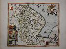
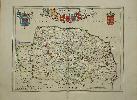
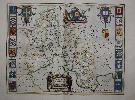
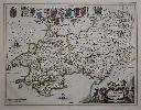
Imprint: Amsterdam, 1645-[62]
430 x 500 mm., in SUPERB early outline colour with extensive additional gilt and silver decoration and blue wash to the sea, in very good condition.
This map of Lincolnshire is by Joan Blaeu (1598-1673), arguably the most famous of the Dutch cartographers. Here it is offered in EXTRA FINE COLOURING WITH EXTENSIVE USE OF GOLD. During the seventeenth century the Dutch held a dominant position in the production of high quality atlases. One of the more visual aspects of this was the reputation of its colourists. At its peak certain colourists began to produce work of an exceptional nature. Arguably the most famous of these was Dirk Jansz. Van Santen (1637/38-1708). Goedings made a study of his work in 1992. Although we are not stating that this is an example of his colouring many of his traits are repeated in this work. Goedings reports that Fontaine Verwey is of the opinion that Van Santen coloured atlases in three different ways: colouring without gold; gold just for the legends, cartouches, coats of-arms and decorative motifs of a map; and gold on the maps themselves, for frontiers, cities, etc.. About the only trait not found in this collection of maps is that of extending the foreground or background of the cartouches.The style of colouring is described by Goedings as signified by rich and exotic colour combinations, added elements such as flowers to clothing, marbling to masonry. He applied transparent and opaque colours at the same time in both mixed and pure tints. He often painted the whole surface of the map or illustration, transforming the graphic light and dark contrasts into colour
He applied his characteristic shiny varnish, this had the effect of brightening the colour, frequently making use of the same colour progression
His use of colour was much freer than that of other colourists. The tone of the colours was made to complement the gold he used so lavishly. In his best work two other costly pigments, ultramarine and carmine are found in large amounts, mostly set against gold. Ultramarine and gold were a very popular colour combination in the seventeenth century
Moreover, he added elements to the design, such as patterns and flower motifs to the clothing of figures, veining of stones or map frontier lines
Van Santen applied transparent and opaque colours at the same time in both mixed and pure tints
Above all things Van Santen distinguished himself from his contemporaries in his lavish use of gold which he applied meticulously. On maps he applied gold not only to the decorative motifs, the legends, cartouches and coats-of-arms, but he also worked it decoratively into the map itself.Goedings goes on to describe Van Santens use of 'shell gold'. Gold leaf was available in small booklets of approximately 5 x 5 centimetres containing a number of very thin sheets of gold. A 17th century method of making shell gold from gold leaf was to grind it on a rubbing stone along with honey, water and salt and then to wash it in very clean water. The small amount of liquid gold was then placed in a shell and vinegar was added to it. The vinegar assured a good consistency
Needless to say, this high quality shell gold was very expensive and must have been paid for by the customers of large, prestigious projects, as in the case of Van der Hem. Seventeenth century instructions for applying gold to paper have been preserved and give an indication of the complexity of this treatment. In all likelihood, Van Santen had developed his own method for applying gold to paper
As far as one can tell with the naked eye, he first put on a yellow base before using a brush to apply the gold. Scientific tests might make it possible to determine more about Van Santen's characteristic use of material, particularly about his use of gold. This could make it easier to identify his work. All of these traits can be seen on these particular examples, however we cannot say who the colourist is.Joan Blaeu's father Willem established his firm in 1599 as instrument and globe makers. He went on to produce some of the highest quality atlases ever published. This example is from the rare final Spanish text issue of the 'Atlas Major' whose production was interrupted by the great fire at the Blaeu publishing house in 1672. Lower left are the arms of the various nobles of the county with extensive gilding. Carroll 12; Goedings, Truusje (1992) 'Master Colourist Dirk Jansz. Van Santen 1637/38-1708'; Koeman Bl 60A p. 281; Van der Krogt, P. (Atlantes) 5330:2; Skelton (1970) 28 & 73.
Stock number:8862.
|
|
|
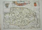
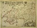
Imprint: Amsterdam, 1645-[46]
430 x 500 mm., in early outline colour, in very good condition.
This map of Lincolnshire is by Joan Blaeu (1598-1673), arguably the most famous of the Dutch cartographers. During the seventeenth century the Dutch held a dominant position in the production of high quality atlases. Joan Blaeu's father Willem, established his firm in 1599 as instrument and globe makers. He went on to produce some of the highest quality atlases ever published. This example is from the Dutch edition of the English volume first published in 1646. Lower left are the arms of the various nobles of the county. Carroll (1996) 12; Koeman Bl 45A p. 180; Van der Krogt, P. (Atlantes) 5330:2; Skelton (1970) 28 & 73.
Stock number:10428.
|
|
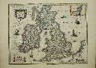
Imprint: Amsterdam, 1648
470 x 555 mm., in fine early outline colour and good condition.
A beautifully engraved map of the British Isles from the renowned Willem Blaeu. It features a great deal of detail and yet manages not to feel 'heavy' as did earlier Dutch material. It includes an inset map of the Orkney Isles top right. The title is set in a handsome cartouche upper left which along with those containing the inset map, scale of miles and imprint are all beautifully wash coloured. The map appeared in most of the Bleau atlases and specifically in the 'Atlas Novus' volume of England and Wales from 1645. This attractive example, with German text on the reverse appeared in the 1648 edition. Koeman Bl47D; Skelton 28 & 44; Van der Krogt, P. (Atlantes) 5750:2; Shirley 411.
Stock number:9360.
|
|
Imprint: Amsterdam, 1645
39 x 40.5cm. With early outline wash colour. Slight paper crease not affecting engraved surface.
ex 'Novus Atlas'. Joan Blaeu (1598-1673) is one of the most famous of the Dutch cartographers. The fourth volume of his atlas focused on England and Wales. Blaeu established his firm in 1599 as instrument and globe makers. He went on to produce some of the highest quality atlases ever published.
Stock number:2591.
|
|
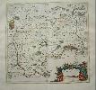
Imprint: Amsterdam, 1645-[62]
385 x 505 mm., in SUPERB early outline colour with extensive additional gilt decoration and blue wash to the sea, with large margins, in very good condition.
This map of Montgomery and Merionith is by Joan Blaeu (1598-1673), arguably the most famous of the Dutch cartographers. Here it is offered in EXTRA FINE COLOURING WITH EXTENSIVE USE OF GOLD. During the seventeenth century the Dutch held a dominant position in the production of high quality atlases. One of the more visual aspects of this was the reputation of its colourists. At its peak certain colourists began to produce work of an exceptional nature. Arguably the most famous of these was Dirk Jansz. Van Santen (1637/38-1708). Goedings made a study of his work in 1992. Although we are not stating that this is an example of his colouring many of his traits are repeated in this work. Goedings reports that Fontaine Verwey is of the opinion that Van Santen coloured atlases in three different ways: colouring without gold; gold just for the legends, cartouches, coats of-arms and decorative motifs of a map; and gold on the maps themselves, for frontiers, cities, etc.. About the only trait not found in this collection of maps is that of extending the foreground or background of the cartouches.The style of colouring is described by Goedings as signified by rich and exotic colour combinations, added elements such as flowers to clothing, marbling to masonry. He applied transparent and opaque colours at the same time in both mixed and pure tints. He often painted the whole surface of the map or illustration, transforming the graphic light and dark contrasts into colour
He applied his characteristic shiny varnish, this had the effect of brightening the colour, frequently making use of the same colour progression
His use of colour was much freer than that of other colourists. The tone of the colours was made to complement the gold he used so lavishly. In his best work two other costly pigments, ultramarine and carmine are found in large amounts, mostly set against gold. Ultramarine and gold were a very popular colour combination in the seventeenth century
Moreover, he added elements to the design, such as patterns and flower motifs to the clothing of figures, veining of stones or map frontier lines
Van Santen applied transparent and opaque colours at the same time in both mixed and pure tints
Above all things Van Santen distinguished himself from his contemporaries in his lavish use of gold which he applied meticulously. On maps he applied gold not only to the decorative motifs, the legends, cartouches and coats-of-arms, but he also worked it decoratively into the map itself.Goedings goes on to describe Van Santens use of 'shell gold'. Gold leaf was available in small booklets of approximately 5 x 5 centimetres containing a number of very thin sheets of gold. A 17th century method of making shell gold from gold leaf was to grind it on a rubbing stone along with honey, water and salt and then to wash it in very clean water. The small amount of liquid gold was then placed in a shell and vinegar was added to it. The vinegar assured a good consistency
Needless to say, this high quality shell gold was very expensive and must have been paid for by the customers of large, prestigious projects, as in the case of Van der Hem. Seventeenth century instructions for applying gold to paper have been preserved and give an indication of the complexity of this treatment. In all likelihood, Van Santen had developed his own method for applying gold to paper
As far as one can tell with the naked eye, he first put on a yellow base before using a brush to apply the gold. Scientific tests might make it possible to determine more about Van Santen's characteristic use of material, particularly about his use of gold. This could make it easier to identify his work. All of these traits can be seen on these particular examples, however we cannot say who the colourist is.Joan Blaeu's father Willem established his firm in 1599 as instrument and globe makers. He went on to produce some of the highest quality atlases ever published. This example is from the rare final Spanish text issue of the 'Atlas Major' whose production was interrupted by the great fire at the Blaeu publishing house in 1672. Booth (1977) pp. 44-8; Goedings, Truusje (1992) 'Master Colourist Dirk Jansz. Van Santen 1637/38-1708'; Koeman Bl 60A p. 281; Van der Krogt, P. (Atlantes) 5545:2; Skelton (1970) 28 & 73.
Stock number:8878.
|
|
|
Imprint: Amsterdam, 1645
385 x 505 mm., in early outline colour with wash to the cartouches, with good margins, with French text, in very good condition.
This map of Monmouthshire is by Joan Blaeu (1598-1673), arguably the most famous of the Dutch cartographers. During the seventeenth century the Dutch held a dominant position in the production of high quality atlases. Joan Blaeu's father Willem, established his firm in 1599 as instrument and globe makers. He went on to produce some of the highest quality atlases ever published. This example is with French text on the verso and from the 'Theatre du Monde' first issued in 1645. Booth (1977) pp. 44-8; Koeman Bl 42A p. 174; Skelton (1970) 28.
Stock number:10062.
|
|
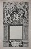
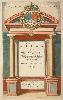
Imprint: Amsterdam, 1662
420 x 240 mm., trimmed slightly but with good margins, otherwise in good condition.
This ornate frontispiece is from Joan Blaeu's 'Atlas Major' and is dated 1662.
Stock number:8726.
|
|
Imprint: Amsterdam, 1645
380 x 495 mm., early outline colour, in good condition.
Willem Blaeu established the firm in 1599 as instrument and globe makers. His first topographical atlas appeared in 1630 in one volume and was gradually expanded. By 1640 the 'Novus Atlas' by his Joan Blaeu (1598-1673) was in three volumes and contained just 4 British Isles maps. His chief rival, the Hondius-Jansson atlas contained 18 maps. Both joined a race to make their fourth volumes a complete atlas of the British Isles. Blaeu was first, publishing his magnificent work in 1645, one year before that of Janssons. The work of Blaeu set a standard of design, beauty and quality that arguably has never been surpassed. He went on to produce some of the highest quality atlases ever published. This map of Norfolk bears attractive coats of arms. This is an early example from 1648 with German text. Frostick 14.1; Koeman Bl47D; Skelton 28 & 44; Van der Krogt, P. (Atlantes) 5295:2.
Stock number:9365.
|
|
Imprint: Amsterdam, 1645
380 x 495 mm., early outline and wash colour, in good condition.
From the 'Novus Atlas' by Joan Blaeu (1598-1673), one of the most famous of the Dutch cartographers. The fourth volume of his atlas focused on England and Wales. Blaeu established his firm in 1599 as instrument and globe makers. He went on to produce some of the highest quality atlases ever published. Frostick Norfolk 14.1.
Stock number:2597.
|
|
Imprint: Amsterdam, 1647
405 x 245 mm. Decorative item, in early colour, minor finger soiling in lower right corner.
This ornate title page is from Joan Blaeu's 1647 German edition of the 'Novus Atlas'.
Stock number:2795.
|
|
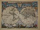
Imprint: Amsterdam, 1606-[c.1640]
410 x 550 mm., in early wash colour, light even toning, a slight area of offset in upper central vignette otherwise a good example.
Willem Janszoon, or Blaeu as he was later to be known, had been issuing separately published maps since 1604. The only atlases he was producing at this time were of the sea. In 1606 he produced this CLASSIC SINGLE SHEET MAP OF THE WORLD on Mercators projection. This map arguably more than any other helped to popularise the by now nearly fifty year old projection. It is celebrated as one of the supreme examples of the map makers art (Shirley). Schilder praises the map very highly stating that the balanced composition and elegant ornamentation make this world map one of the small masterpieces of the seventeenth century.Cartographically it is drawn from Blaeus own double-hemispheric projection 20-sheet wall map, the sole surviving example is in the Hispanic Society of America, New York, in rather poor condition. Its engraver is believed to be Joshua van den Ende who also produced this single sheet map. The wall map was published at the behest of the Dutch States-General who encouraged Blaeu to utilise the very latest knowledge. As a result it is the most accurate world map published to date. Because Mercators projection particularly distorted the higher latitudes Blaeu incorporates in the lower corners two hemispherical maps of the Polar Regions. It is dedicated to Cornelis Pietersz Hooft (1547-1626) a wealthy administrator and merchant in Amsterdam. At the same time Blaeu was working on a four-sheet version also in Mercators projection. This map was known in just two examples prior to the Second World War and both were lost in the conflict. In 1980 the four map sheets alone were discovered in Berne, Switzerland.In 1617 the results of Jacob le Maire and Willem Cornelisz Schoutens voyage around Cape Horn became known. They showed that Tierra del Fuego was an island and not connected to the unknown southern continent. Owing to law suits that were filed between the Australian Company and the Dutch East India Company, Blaeu was legally barred from incorporating this new information on his maps and globes in July 1617. This restriction was not lifted until August of the following year. Blaeu immediately updated this work to include Fretum Magalanicum and State landt. The first three states of the map were separately published and as such are of extreme rarity. It is the fourth state which was incorporated into Blaeus first folio terrestrial atlas, the Atlantis Appendix of 1630. This was Blaeus first attempt at a world atlas, largely instigated by his purchase in 1629 of a number of Jodocus Hondius plates, and in the following years he would experiment with various formats. The Atlas Novus as it would become was issued from 1635 to 1658 expanding along the way to consist of six volumes. This maps popularity rests on its association with arguably the greatest Dutch cartographer of all time. One of the classic features of the map is the four decorative border panels. Above are seven allegorical images of the sun, moon and the five planets known. The left side features four vignettes of the elements - Fire, Air, Water and Earth. The right displays the four seasons. Matching the seven vignettes above are seven below of the wonders of the world. Schilder in his Monumenta IV details magnificently the origin of much of this imagery. Blaeu died in 1638 and the business passed to his sons, Cornelis and Joan. The latter particularly carried the family name and was the driving force behind the multi-volume Atlas Major. Provenance: private English collection since the 1970s. Van der Krogt (1997-2003) 0001:2A; Shirley (1984) 255, state 4; Schilder (1993) 10.4 pp. 41, 171-83; Schilder (2000) 1.4 pp. 86-9.
Stock number:6212.
|
|
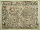
Imprint: Amsterdam, 1662
Edition: First Edition 410 x 545 mm., early wash colour, some light toning in the margins due to previous framing, one small wormhole in upper margin, otherwise in good condition.
A classic double-hemisphere world map here in its FIRST EDITION published with Latin text in Joan Blaeuâs magnum opus, the âAtlas Majorâ. Joan Blaeuâs father Willem Blaeu first published the Mercator projection world map in 1606 and had been included in the Blaeu firmâs atlases from 1630. This newly engraved double-hemispheric map was produced for the âAtlas Majorâ, the monumental work is considered the greatest of all atlases. âThe Great Atlas by the Blaeuâs is one of the monuments of map production, and for size and beauty and accuracy has never been surpassedâ (World Encompassed no. 149). âThe contents of this unprecedented atlas illustrate the high standards of contemporary cartography and geographical knowledge, and its presentation bears witness to the superb craftsmanship of engraver, printer, binder, and papermakerâ (Koeman (1970) Joan Blaeu and his Grand Atlas, pp. 1-3).Cartographically it resembles his own large wall map of 1648 with new additions, specifically in the west coast of North America. California is still depicted as an outline but now with a flatter north coast known as the Briggs type. Similarly, a reference to Sir Francis Drake and Anian are also additions here. The map is surrounded by spandrel vignettes which incorporate allegorical images of the four seasons and celestial figures. The four seasonal characters are seen sitting in chariotâs, from left to right; spring, summer, autumn and winter. Each are drawn by various fauna. An image of Galileo Galilei sits over the western hemisphere whilst Tycho Brahe is to the right. Koeman (1967-70) Bl 56 no. 435; Van der Krogt (1997-2010) (Vol. II) 0001:2B; Shirley (1984) 428.
Stock number:9126.
|
|
Imprint: Amsterdam, 1635-55
410 x 250 mm. Uncoloured, with some foxing, and browning. With publishers printed overlay on title and publishing details.
This ornate title page is from Joan Blaeu's 1642 German edition of the 'Novus Atlas'.
Stock number:2760.
|
|
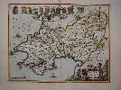
Imprint: Amsterdam, 1645
390 x 510 mm., in early outline colour, the very ends of the centrefold top and bottom a little week, otherwise in good condition.
Joan Blaeu (1598-1673) is one of the most famous of the Dutch cartographers. The fourth volume of his 'Novus Atlas' focused on England and Wales. Blaeu established his firm in 1599 as instrument and globe makers. He went on to produce some of the highest quality atlases ever published. This map is one of the most desirable in the atlas covering the county of Oxfordshire. The Arms of Oxford's colleges are along the sides along with their dates of founding. An ornate title cartouche depicts two scholars. With a stylised view of Stonehenge on the verso. Rawnsley 10; Skelton 28; Van der Krogt, P. (Atlantes) 5265:2.
Stock number:6197.
|
|
Imprint: Amsterdam, 1645-[48]
390 x 510 mm., in early outline colour, in good condition.
Willem Blaeu established the firm in 1599 as instrument and globe makers. His first topographical atlas appeared in 1630 in one volume and was gradually expanded. By 1640 the 'Novus Atlas' by his Joan Blaeu (1598-1673) was in three volumes and contained just 4 British Isles maps. His chief rival, the Hondius-Jansson atlas contained 18 maps. Both joined a race to make their fourth volumes a complete atlas of the British Isles. Blaeu was first, publishing his magnificent work in 1645, one year before that of Janssons. The work of Blaeu set a standard of design, beauty and quality that arguably has never been surpassed. He went on to produce some of the highest quality atlases ever published. This map is one of the most desirable in the atlas covering the county of Oxfordshire. The Arms of Oxford's colleges are along the sides along with their dates of founding. An ornate title cartouche depicts two scholars. With a view of a stone circle on the verso in early wash colour. This is an early example from 1648 with German text. Koeman Bl47D; Skelton 28 & 44; Van der Krogt, P. (Atlantes) 5265:2.
Stock number:9008.
|
|
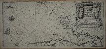
Imprint: Amsterdam, 1608
250 x 555 mm., small paper crease lower left of centre, two small marks in lower margin, otherwise a very good example.
Willem Jansz. Blaeu is one of the greatest Dutch cartographers of all time. It is little known that he began his atlas productions by publishing sea atlases. His first work was the 'Het Licht der Zee-Vaert' in 1608. It is one of the most important Dutch pilot-guides rivalling and surpassing the Thresoor der Zeevaaerdt of Lucas Waghenaer which was first published some sixteen years earlier and ceased with the issue of the ninth edition one year later in 1609 (Wardington). In the history of early Dutch pilot guides Blaeus work takes a very prominent place" (Koeman). Blaeu was granted a privilege in ten years which expired in 1618. Two years later Jan Jansson published his own version in which the copper plates were engraved by Pieter van den Keere.This particular chart extends from the Scilly Islands along the north coasts of Cornwall, Devon and Somerset displaying both Bristol and Gloucester. It then extends westwards along the south coast of Wales and even shows the entrance to Waterford, Ireland. The map is orientated roughly north west at the top to line up the Cornish peninsulas coastline across the bottom of the chart. The sea is decorated with a ship, compass rose and fish. The title in Dutch is repeated in French. Provenance: private English collection. Koeman IV pp. 27-34 M. Bl. 1, no. 18; Shirley (2004) refer M.Bla 1a; Skelton (1964b).
Stock number:7747.
|
|
Imprint: Amsterdam, 1645-[62]
410 x 535 mm., in SUPERB early outline colour with extensive additional gilt and silver decoration and blue wash to the sea, with large margins, minor paper crease otherwise in very good condition.
This map of Pembroke and Carmarthen is by Joan Blaeu (1598-1673), arguably the most famous of the Dutch cartographers. Here it is offered in EXTRA FINE COLOURING WITH EXTENSIVE USE OF GOLD. During the seventeenth century the Dutch held a dominant position in the production of high quality atlases. One of the more visual aspects of this was the reputation of its colourists. At its peak certain colourists began to produce work of an exceptional nature. Arguably the most famous of these was Dirk Jansz. Van Santen (1637/38-1708). Goedings made a study of his work in 1992. Although we are not stating that this is an example of his colouring many of his traits are repeated in this work. Goedings reports that Fontaine Verwey is of the opinion that Van Santen coloured atlases in three different ways: colouring without gold; gold just for the legends, cartouches, coats of-arms and decorative motifs of a map; and gold on the maps themselves, for frontiers, cities, etc.. About the only trait not found in this collection of maps is that of extending the foreground or background of the cartouches.The style of colouring is described by Goedings as signified by rich and exotic colour combinations, added elements such as flowers to clothing, marbling to masonry. He applied transparent and opaque colours at the same time in both mixed and pure tints. He often painted the whole surface of the map or illustration, transforming the graphic light and dark contrasts into colour
He applied his characteristic shiny varnish, this had the effect of brightening the colour, frequently making use of the same colour progression
His use of colour was much freer than that of other colourists. The tone of the colours was made to complement the gold he used so lavishly. In his best work two other costly pigments, ultramarine and carmine are found in large amounts, mostly set against gold. Ultramarine and gold were a very popular colour combination in the seventeenth century
Moreover, he added elements to the design, such as patterns and flower motifs to the clothing of figures, veining of stones or map frontier lines
Van Santen applied transparent and opaque colours at the same time in both mixed and pure tints
Above all things Van Santen distinguished himself from his contemporaries in his lavish use of gold which he applied meticulously. On maps he applied gold not only to the decorative motifs, the legends, cartouches and coats-of-arms, but he also worked it decoratively into the map itself.Goedings goes on to describe Van Santens use of 'shell gold'. Gold leaf was available in small booklets of approximately 5 x 5 centimetres containing a number of very thin sheets of gold. A 17th century method of making shell gold from gold leaf was to grind it on a rubbing stone along with honey, water and salt and then to wash it in very clean water. The small amount of liquid gold was then placed in a shell and vinegar was added to it. The vinegar assured a good consistency
Needless to say, this high quality shell gold was very expensive and must have been paid for by the customers of large, prestigious projects, as in the case of Van der Hem. Seventeenth century instructions for applying gold to paper have been preserved and give an indication of the complexity of this treatment. In all likelihood, Van Santen had developed his own method for applying gold to paper
As far as one can tell with the naked eye, he first put on a yellow base before using a brush to apply the gold. Scientific tests might make it possible to determine more about Van Santen's characteristic use of material, particularly about his use of gold. This could make it easier to identify his work. All of these traits can be seen on these particular examples, however we cannot say who the colourist is.Joan Blaeu's father Willem established his firm in 1599 as instrument and globe makers. He went on to produce some of the highest quality atlases ever published. This example is from the rare final Spanish text issue of the 'Atlas Major' whose production was interrupted by the great fire at the Blaeu publishing house in 1672. Booth (1977) pp. 44-8; Goedings, Truusje (1992) 'Master Colourist Dirk Jansz. Van Santen 1637/38-1708'; Koeman Bl 60A p. 281; Van der Krogt, P. (Atlantes) 5530:2; Skelton (1970) 28 & 73.
Stock number:8879.
|
|
Imprint: Amsterdam, 1645
410 x 530 mm., early outline colour in good condition.
Joan Blaeu (1598-1673) is one of the most famous of the Dutch cartographers. The fourth volume of his 'Novus Atlas' first published in 1645 focused on England and Wales. Blaeu established his firm in 1599 as instrument and globe makers. He went on to produce some of the highest quality atlases ever published. This very decorative map of Pembroke is from the French text edition of 1645, it was re-issued in 1646 and 1648 with the same text setting. Booth (1977) pp. 44-8; Koeman Bl 42A 341; Van der Krogt, P. (Atlantes) 5530:2; Skelton (1970) 28.
Stock number:9006.
|
|
Imprint: Amsterdam, 1645
410 x 530 mm., early outline colour with small paper repair in the sea repaired, otherwise a good example.
ex 'Novus Atlas'. Joan Blaeu (1598-1673) is one of the most famous of the Dutch cartographers. The fourth volume of his atlas focused on England and Wales. Blaeu established his firm in 1599 as instrument and globe makers. He went on to produce some of the highest quality atlases ever published. From the Dutch text edition of 1646 issued one year after initial publication. Skelton 28; Van der Krogt, P. (Atlantes) 5530:2.
Stock number:6202.
|
|